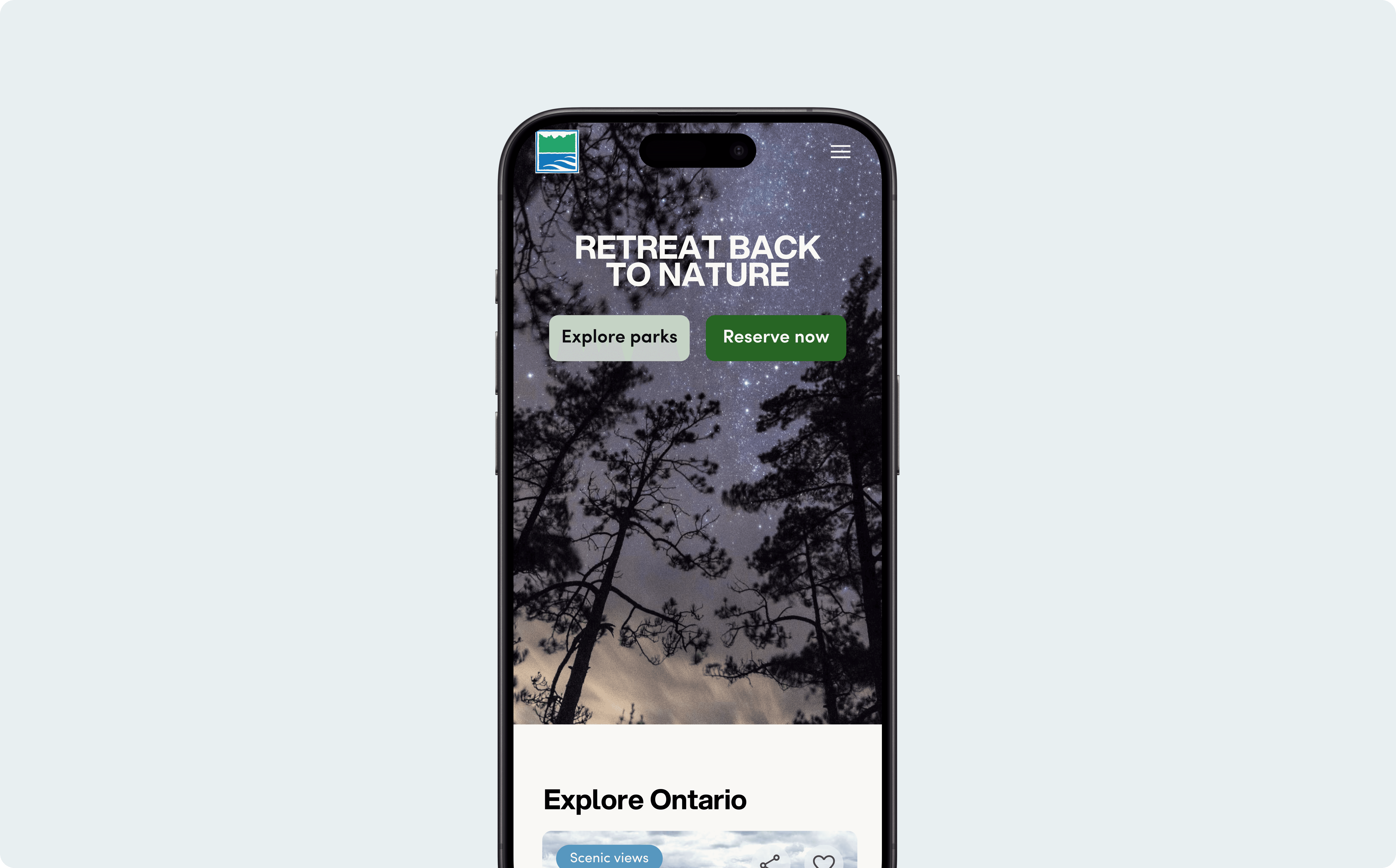
The Mission
Ontario Parks is a local treasure, but its digital experience feels like navigating with an upside-down map. The current flow makes research and booking feel like they live on two different planets.
The Context: Capstone Project for the User Experience Program at Humber College.
The Goal: Modernize the mobile experience for Millennials and Gen Z without alienating "loyal campers."
The Squad & My Role
Working in a collaborative team of designers, I led the UX/UI strategy across the full product lifecycle:
Discovery: Conducted heuristic evaluations and user interviews to identify the "why" behind the booking friction.
Architecture: Owned the Information Architecture and Journey Mapping to bridge the gap between discovery and reservations.
Execution: Delivered high-fidelity designs and interactive prototypes to validate the mobile-first flow.
Impact
+40%
Faster Booking
+14%
Task Success Rate
+1.5
SEQ Improvement
Discovery: Uncovering the "Usability Roadblocks"
We started by auditing the current site, and the results were a bit of a wake-up call. We identified 5 "Usability Catastrophes" and dozens of major friction points.
The Insight: Users were getting "research fatigue." They had to jump between the informational and reservation sites, losing their place each time. Our interviews showed that people were so frustrated that they were calling park reps just to ask basic questions. We realized that empathy meant merging the search and the sale into one flow.
Reality Check: Observing the Friction
To see how the platform performed under pressure, we tested it with eight participants. The feedback was a total "reality check":
The Icon Riddle: Park activities were shown as icons that were impossible to decode without a mouse-over (not great for mobile!).
The List Fatigue: Users hated scrolling through text. They wanted a map for distance and visuals for the "vibe."
The Missing Link: People would fall in love with a park but couldn't find the "Book Now" button. It’s like reaching the summit of a mountain only to find the view is blocked.
The North Star: Three Design Principles
One-Stop Shop:
Centralized the chaos. We turned park pages into a single "source of truth"; no more tab-hunting for maps or fire bans.
Zero Friction
Simplified the path. The squad merged fragmented pages into one flow to get users from "searching" to "booked" faster.
Nature, Rebranded
Traded the "government-drab" look for a fresh visual system that matches the scale of the Ontario wilderness.
Strategy: Connecting the Ecosystem
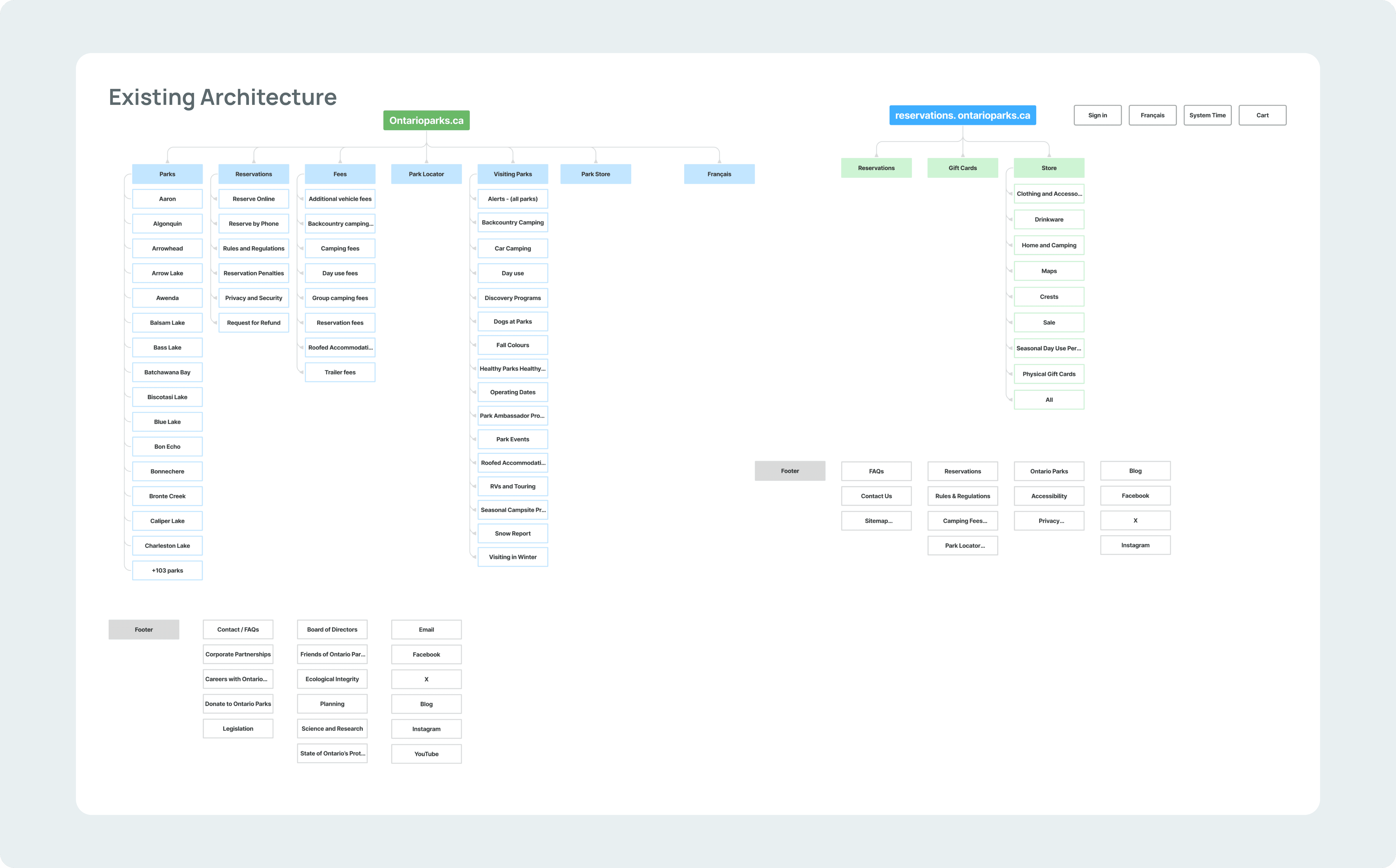
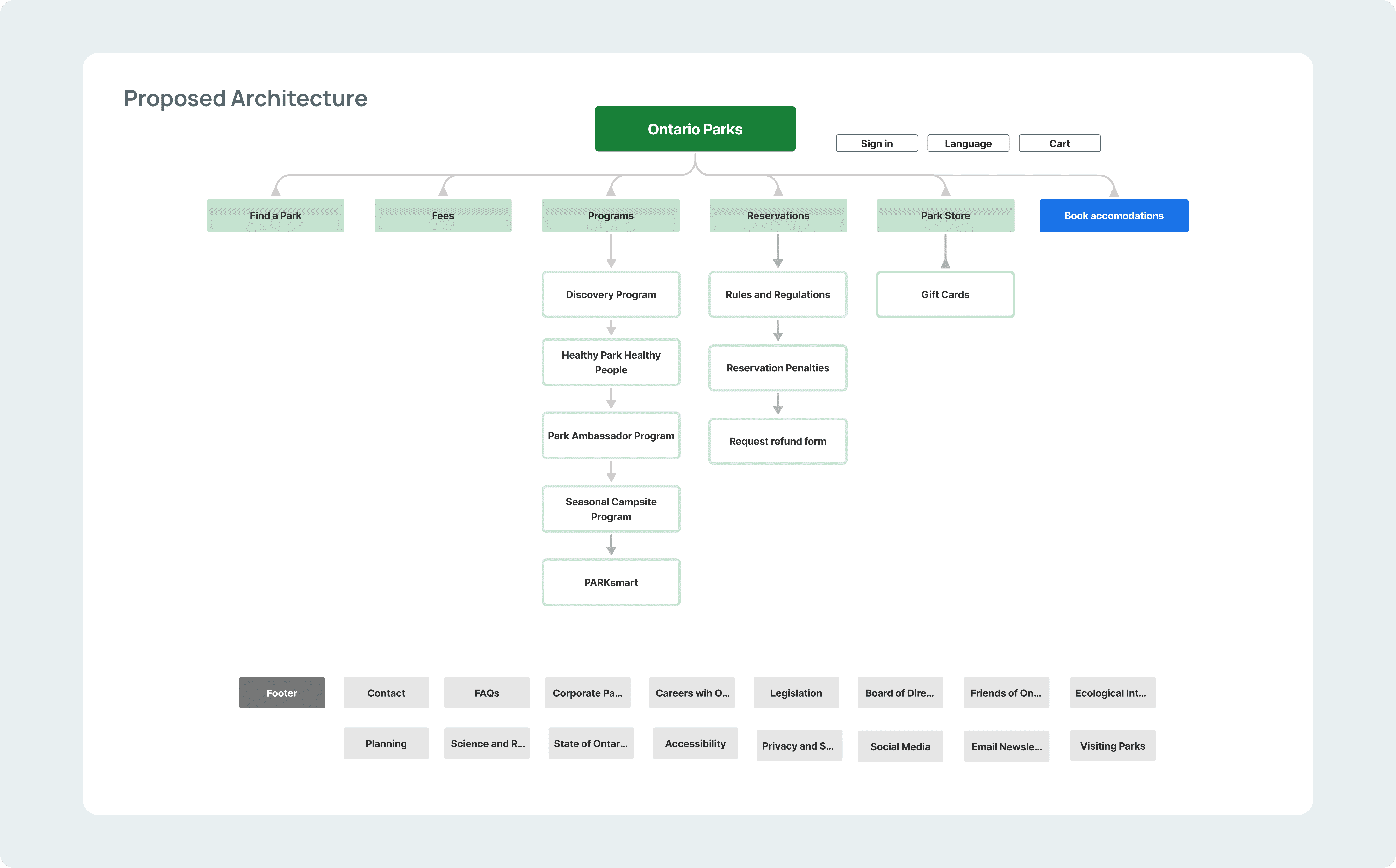
We didn't just move things around; we rebuilt the foundation. I helped lead the charge on a new Information Architecture by being ruthless with the clutter:
The Integration: Combined the "Park Locator" and "Parks" pages. One destination, one door.
The Cleanup: Removed redundant and duplicated pages across the navigation to streamline the user’s mental model.
Seamless Logic: Bridged the gap between the informational site and the booking portal, creating a unified flow that didn't leave users feeling stranded.
Design: Retro Vibes, Modern Logic
For the visual direction, we built a Mood Board inspired by vintage trail guides and landscape photography. We wanted it to feel like a classic adventure but move with the speed of a modern site.
Collaborative Sketching: Our team held a "design showdown." We each sketched ideas and used dot voting to cherry-pick the strongest features. This ensured the final product was a "best-of" collection of our team's thinking.
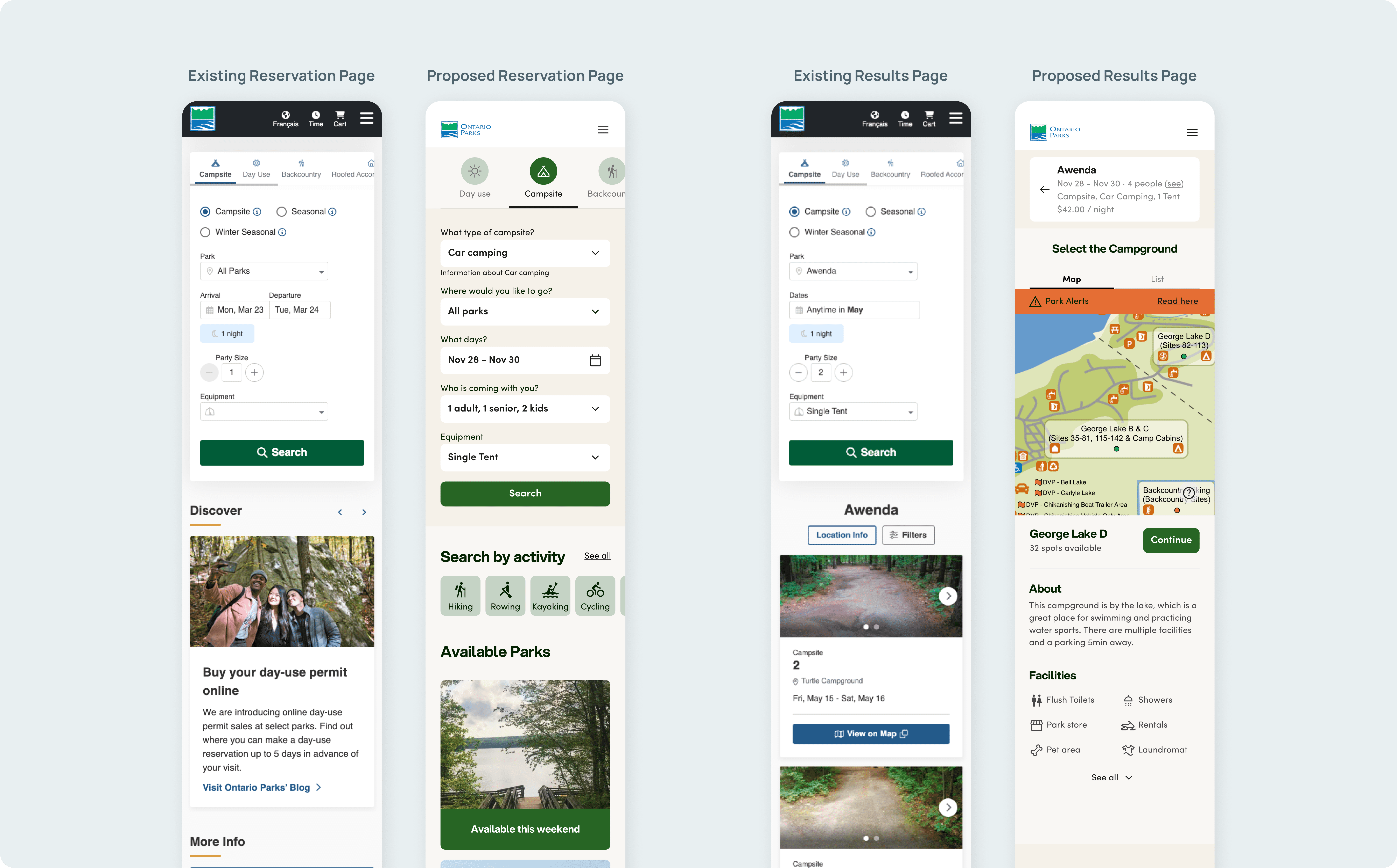
Execution: I crafted high-fidelity wireframes that shifted the focus to "Map-First" discovery and high-impact imagery.

Refinement: The Final Polish
We didn't just cross our fingers; we validated our designs with four more users. We watched them navigate the new "Park Pages" to see if the logic held up.
The Pivot: Based on their feedback, we introduced progressive disclosure (using tabs for Facilities and Activities). This kept the screen clean while giving users the details exactly when they asked for them.

The Results & Lessons
A Unified Path: We turned a fragmented scavenger hunt into a "thumb-friendly" mobile journey.
Strategic Growth: By leaning into maps and visual inspiration, we made the platform a lot more inviting for a younger, tech-savvy audience.
The Big Takeaway: This project proved that collaborative sketching is a superpower. When you mix different perspectives, you end up with a solution that is much more robust than what one person could build in a vacuum.