The Mission
Cox serves 6M+ customers, but their "Communication Preferences" were a maze.
The Goal: Help users manage alerts without a map and compass.
The Timeline: A focused 6-week sprint from audit to validated prototype.
The Squad & My Role
I worked in a high-speed powerhouse (Creative Director, Lead UX, UI, Research, Copy, and PMs). As a UX Designer, I owned:
Strategic Audit: Identifying friction points through heuristics and competitive analysis.
Logic & Wireframing: Building high-fidelity flows that prioritized clarity over "pretty."
Validation: Creating interactive prototypes to settle the "Category vs. Channel" debate with user data.
The "Why"
The thesis: If customers can't find billing or outage alerts, they call support. By untangling the logic, we aimed to empower 6M+ users to self-serve and reduce high-cost support volume.
Impact
100%
Task Success Rate
35%
Reduction in Time-on-Task
0
Interaction Errors
Strategic Discovery: Playing UX Detective
We started with a heuristic evaluation to see where the friction was hiding. I focused on three big pillars: Guidance, Clarity, and Control. One of the biggest takeaways? We needed to stop "surprising" users. Whether it was setting a password or choosing an email frequency, people just wanted to know what was expected of each step. Empathy in design often starts with just being really, really clear.
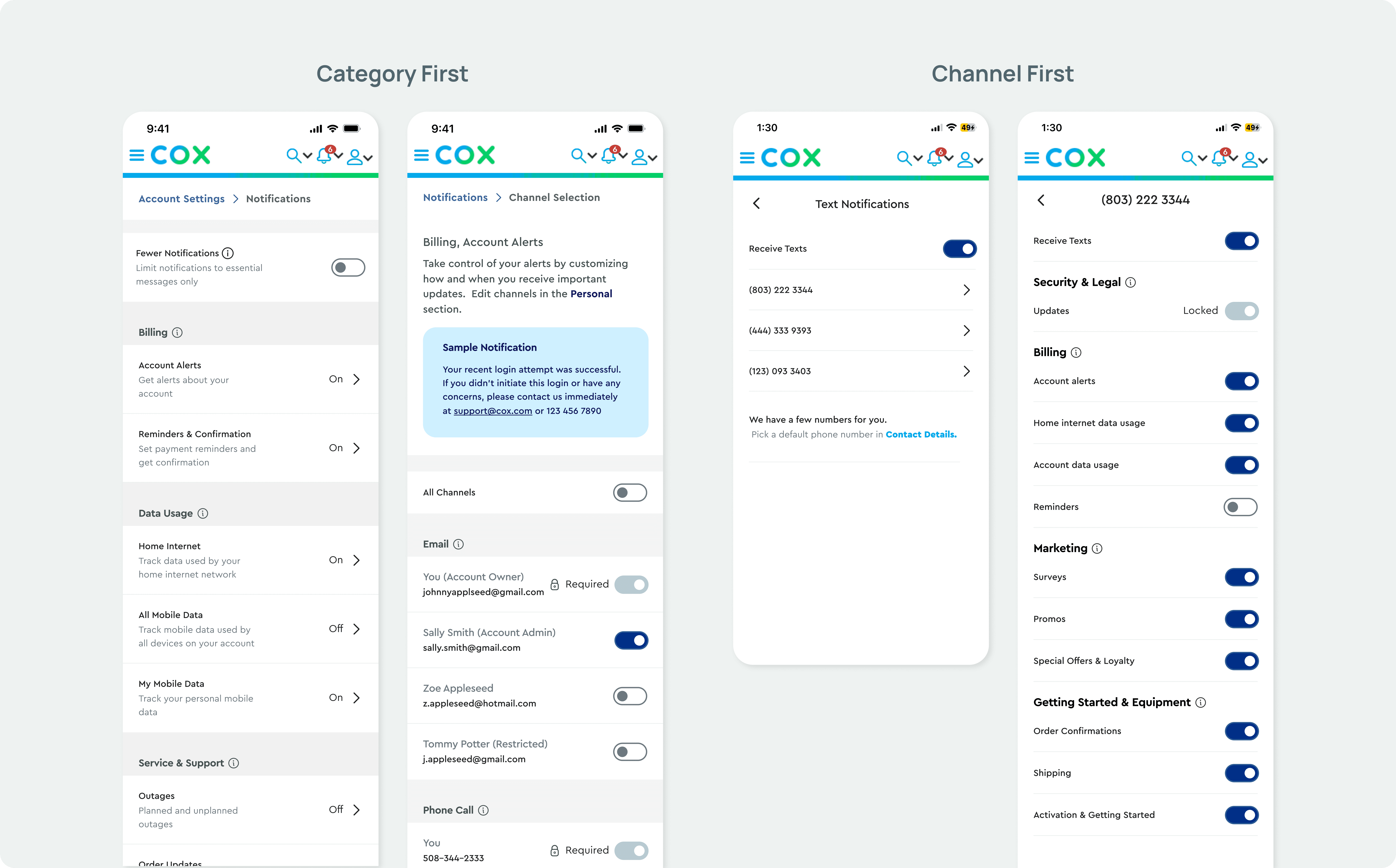
The Great Showdown: Category vs. Channel
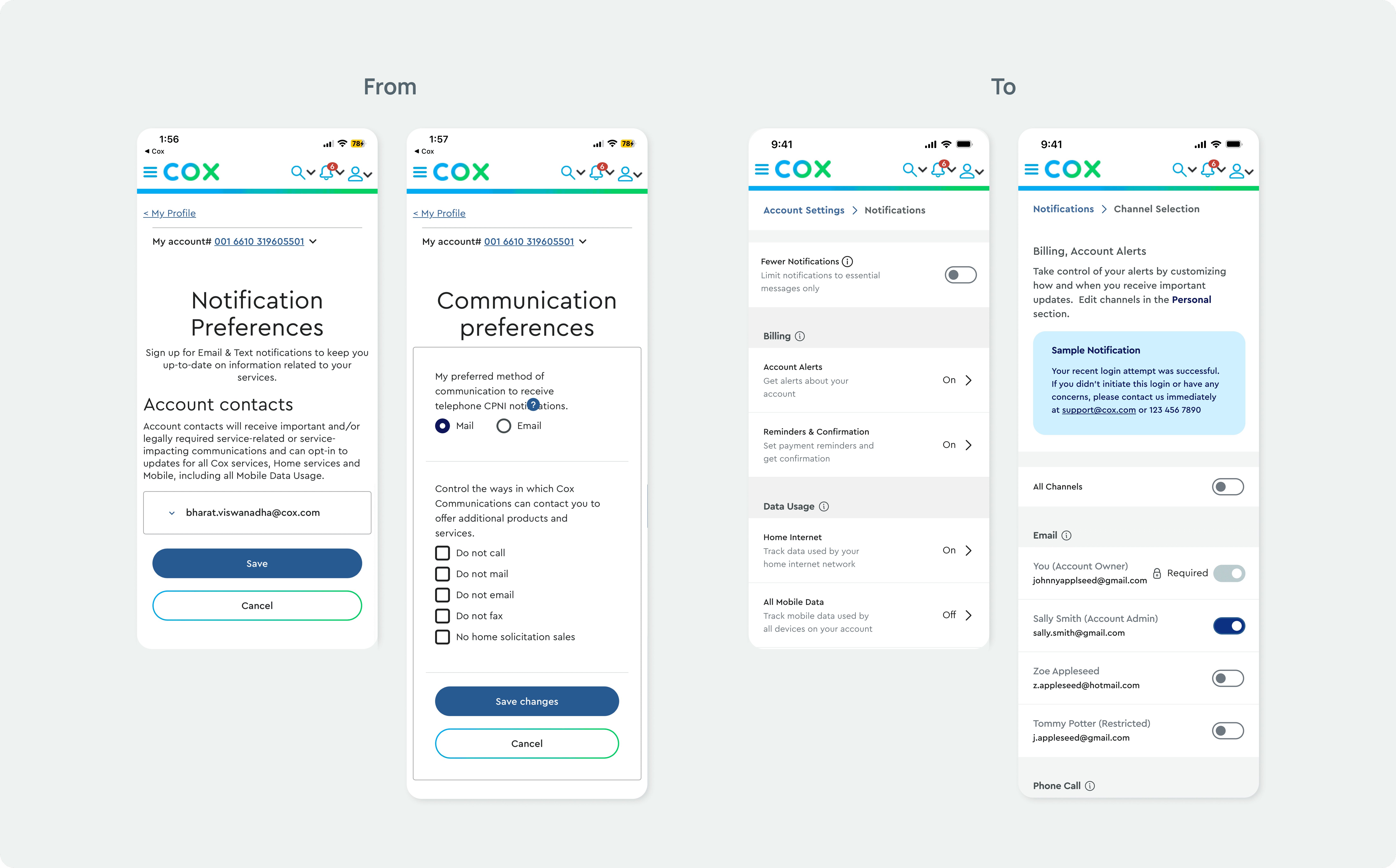
Early on, our team hit a classic "Design Dilemma." Should users manage their notifications by Channel (Email, SMS, Phone) or by Category (Billing, Security, Outages)?
This was a big deal for the business. To settle the debate, we built high-fidelity prototypes for both options. It wasn't about who was "right", it was about seeing which world made the most sense to a human being trying to pay their bill on a Tuesday morning.
The Lab: Reality Testing with 10 Humans
The team put the prototypes to a 10-person stress test. Watching real users interact with our "perfect" logic is the ultimate reality check; here’s how the squad narrowed the signal from the noise:
The 50/50 Split: Testing was a dead heat between Channel and Topic. The team chose Category-based organization for long-term scalability, focusing on the value of the message over the delivery method.
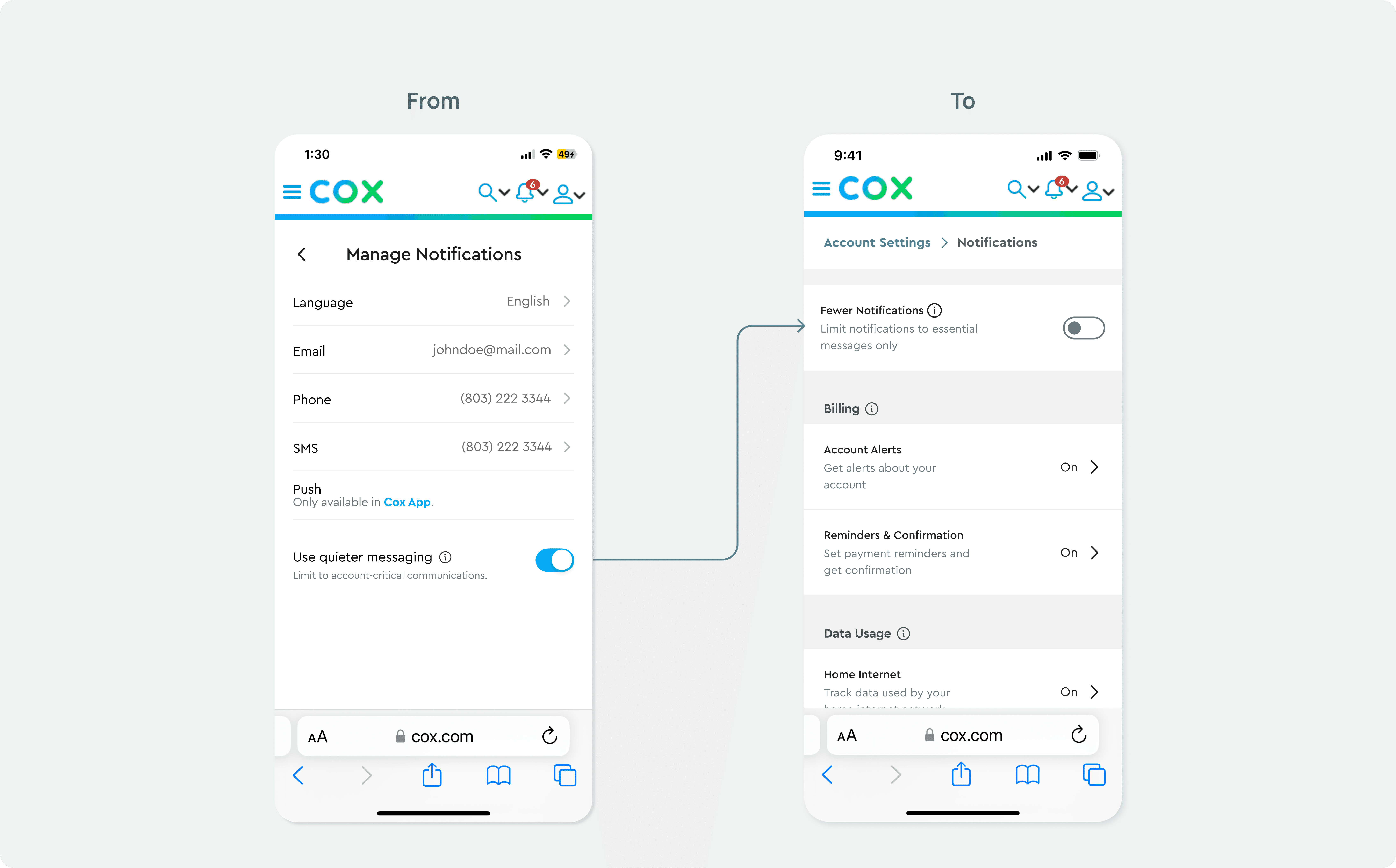
Clarity > Poetry: Swapped "Quieter Messaging" for "Fewer Notifications." Directness is the highest form of empathy; no one wants a "poetic" notification settings page.
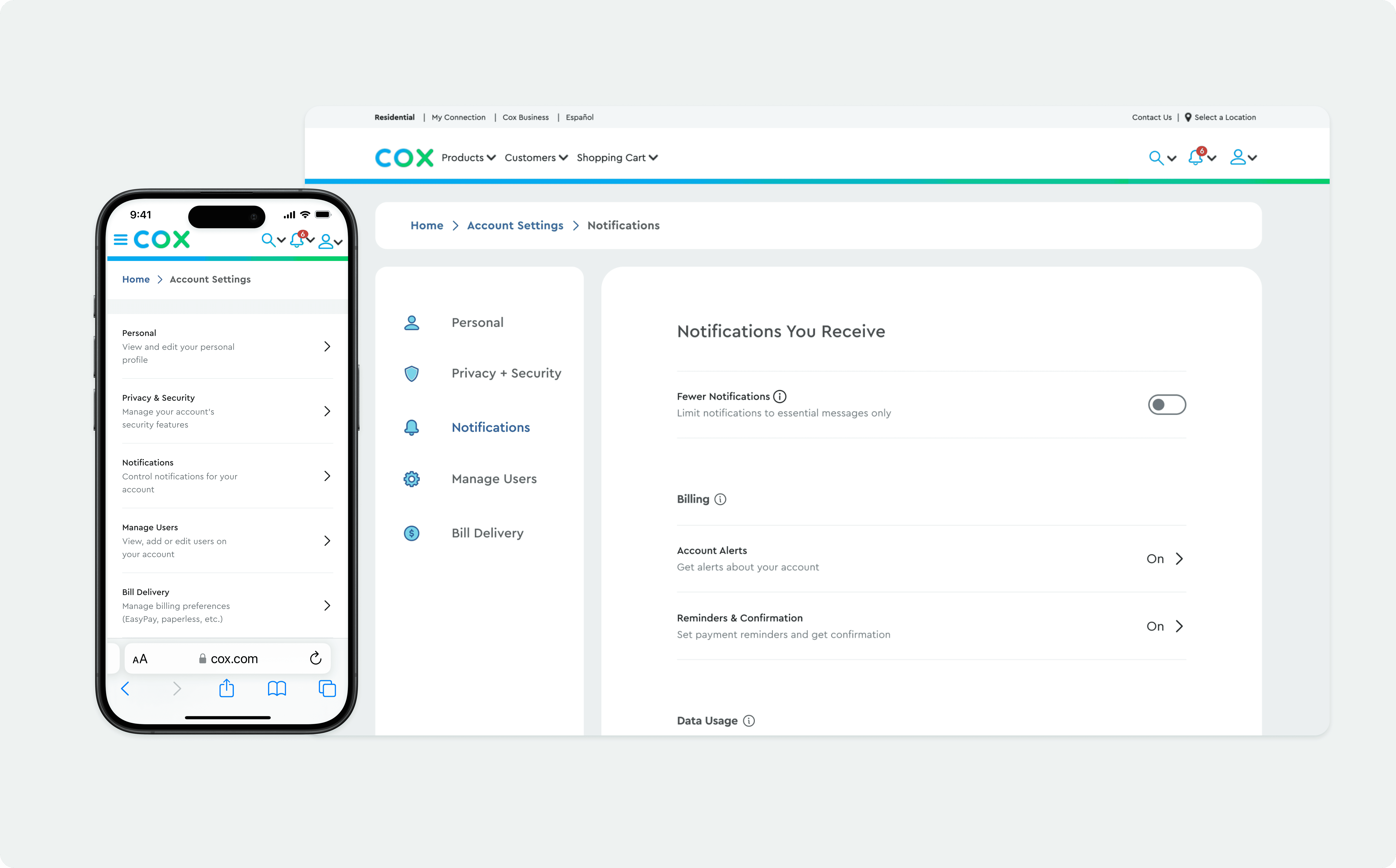
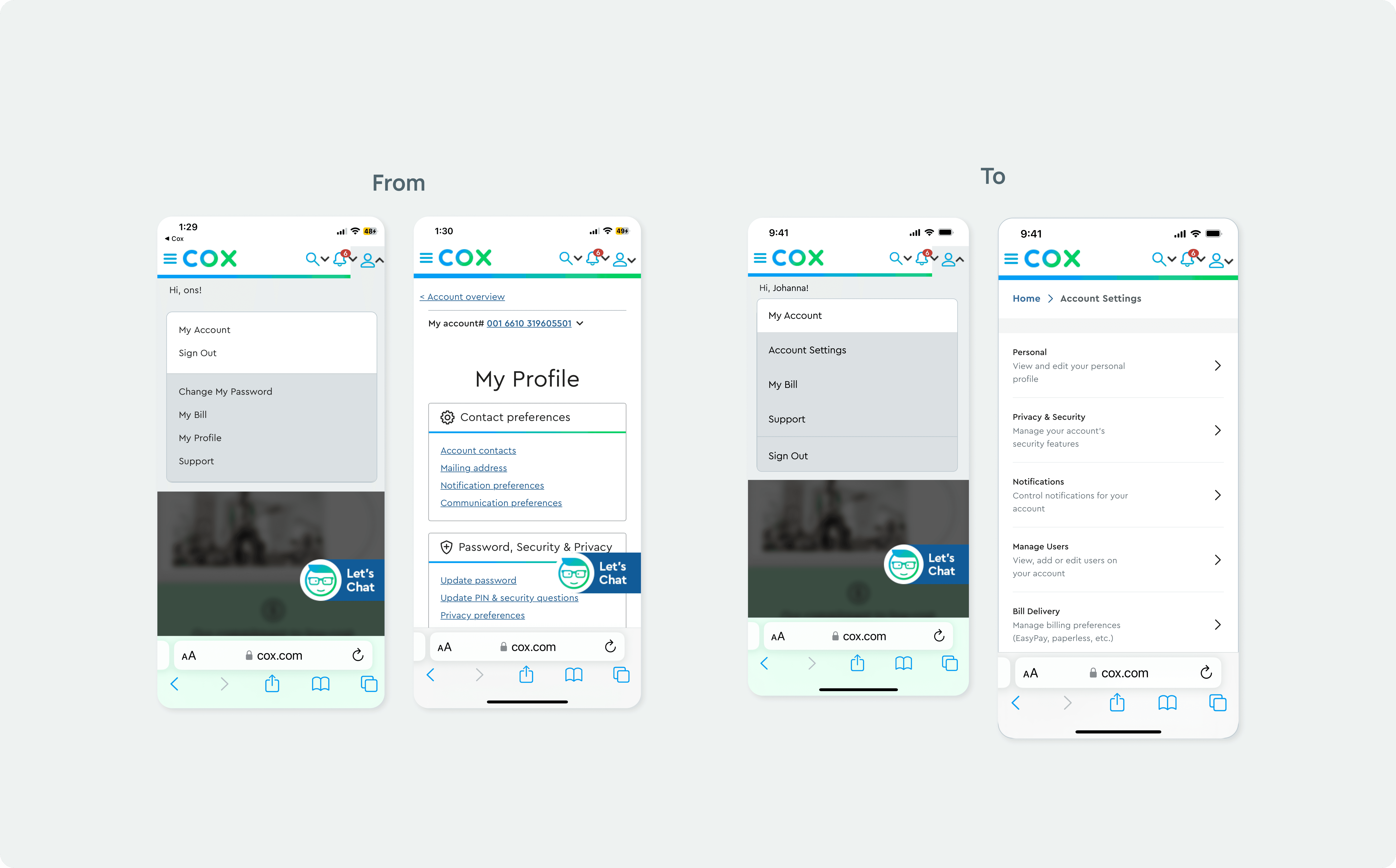
Expectation Met: Users instinctively looked for "Account Settings" under "My Account." We put it exactly where they expected it. No need to over-engineer the obvious.
Execution: Designing for the Real World
Since most of us check our phones while we're doing five other things, I focused heavily on a mobile-first approach. Working alongside our Senior UI Designer, I made sure our wireframes were "thumb-friendly" and consistent with the Cox Design System. I then architected the desktop version, ensuring those "Control Drawers" scaled beautifully on larger screens. We also made sure the architecture was ready for a future "Multi-User" feature, because households are complicated, and our design shouldn't be.
Impact & Outcomes
The Outcome: 6 Weeks, Zero Friction
We hit the deadline with a validated, high-fidelity solution that untangled a massive service maze. But the real impact was the process:
On-Time Delivery: We moved from a complex strategic audit to a tested prototype in a high-intensity 6-week sprint.
Squad Synergy: Working alongside a Creative Director, Lead UX, and Research, we maintained a seamless handoff, proving that high-scale UX doesn’t have to be slow.
Validated Logic: By settling the "Category vs. Channel" debate through user testing, we delivered a roadmap built on data, not just "pretty" pixels.
Reflection
Designing for 6 million users taught me that empathy in UX is often found in the "basic" details, like clear instructional copy and predictable navigation. While it’s tempting to over-engineer solutions, the Cox project proved that the most sophisticated design is often the one that gets out of the user's way the fastest.