The Mission
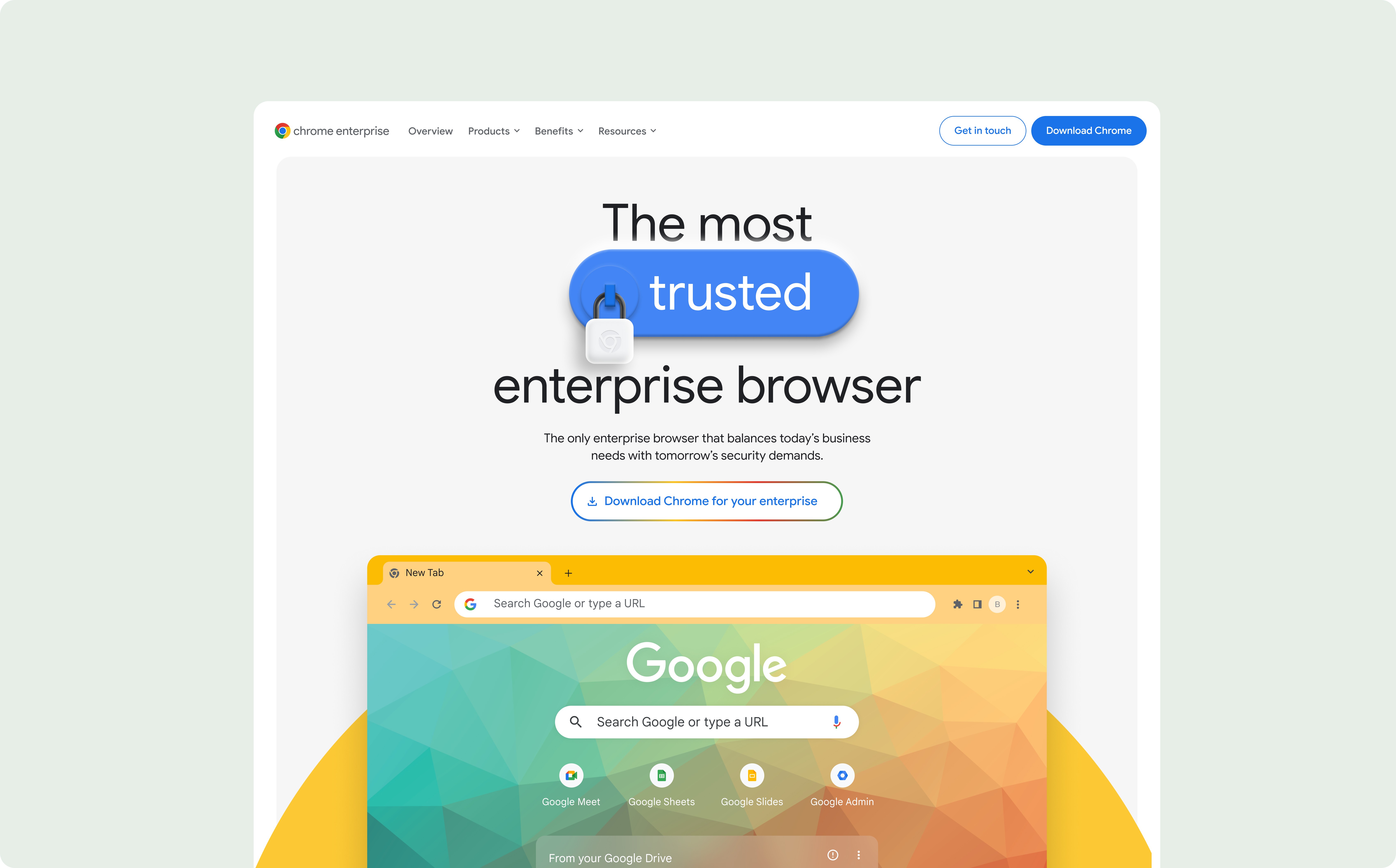
Google Chrome Enterprise is the digital home for two massive products: ChromeOS and Chrome Browser. Our goal was to take one unified site and split it into two distinct, high-performing experiences.
The Crunch:
We had exactly 10 months for a global launch.
The Squad & My Role
I worked within a high-speed, cross-functional team of Creative Directors, a UX Lead, Analysts, and Developers. As a "full-stack UX contributor", I was the bridge between raw data and the final interface, collaborating closely with Visual Designers to bring the brand to life.
My key contributions included:
Strategy: Analyzing third-party data and live-site tests to help define our core Experience Principles.
Architecture: Crafting the Journey Maps and collaborating closely on the Information Architecture.
Execution: Designing the wireframes and building the modular headless components that served as the blueprint for the Visual Design team and allowed us to scale globally within 10 months.
Impact
+9%
Get in Touch submits
+2%
Chrome Browser Downloads
+36%
Interactions with the main nav
Strategic Forensics: Solving the "Trust Gap"
Before wireframing, I played digital detective to find out why the "Contact Sales" button was being ignored. The data didn't lie:
The Vibe Check: 49% of SMBs distrusted traditional enterprise marketing. They wanted peer proof, not a sales pitch.
The Friction: 42% of users were simply lost in the "unified" site’s noise.
The Pivot: We turned those insights into three Experience Principles:
Proven Impact
Move social proof to the top. No more hiding the evidence.
Super-charged Relevance
Tailor the journey to the business size. No "one size fits all."
Purposeful Efficiency
Kill the marketing fluff. Get users to the point, faster.
Learning in the Wild: A/B Testing as Our Compass
Because of our aggressive timeline, we didn't have time for traditional, lab-based usability testing. Instead, we used the live site as our laboratory. As we developed the new site structure, we ran live A/B tests and surveys to see which designs actually solved those friction points. This "build-and-verify" approach ensured that every strategic decision was backed by real-world user behaviour, allowing us to move fast without moving blindly.
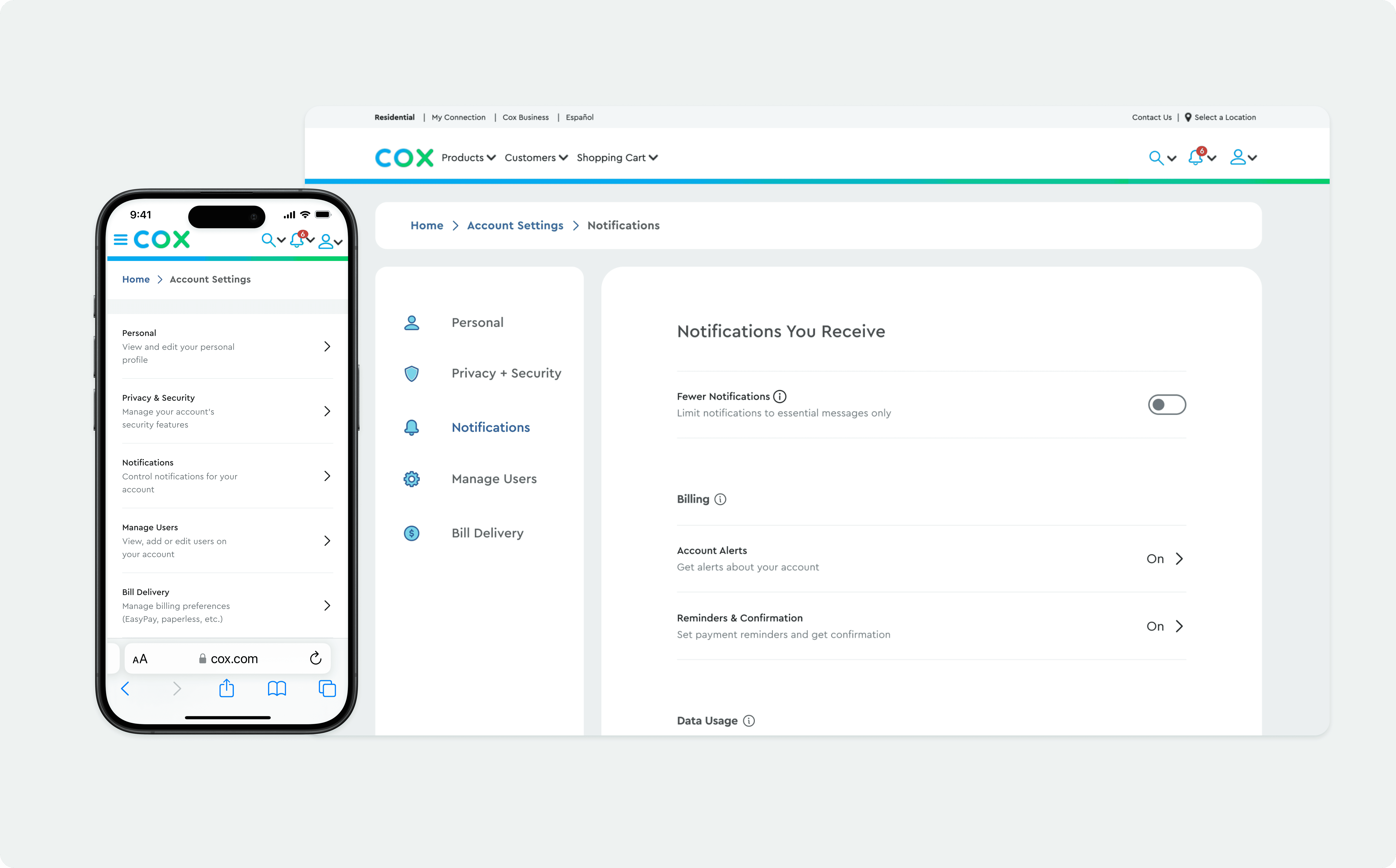
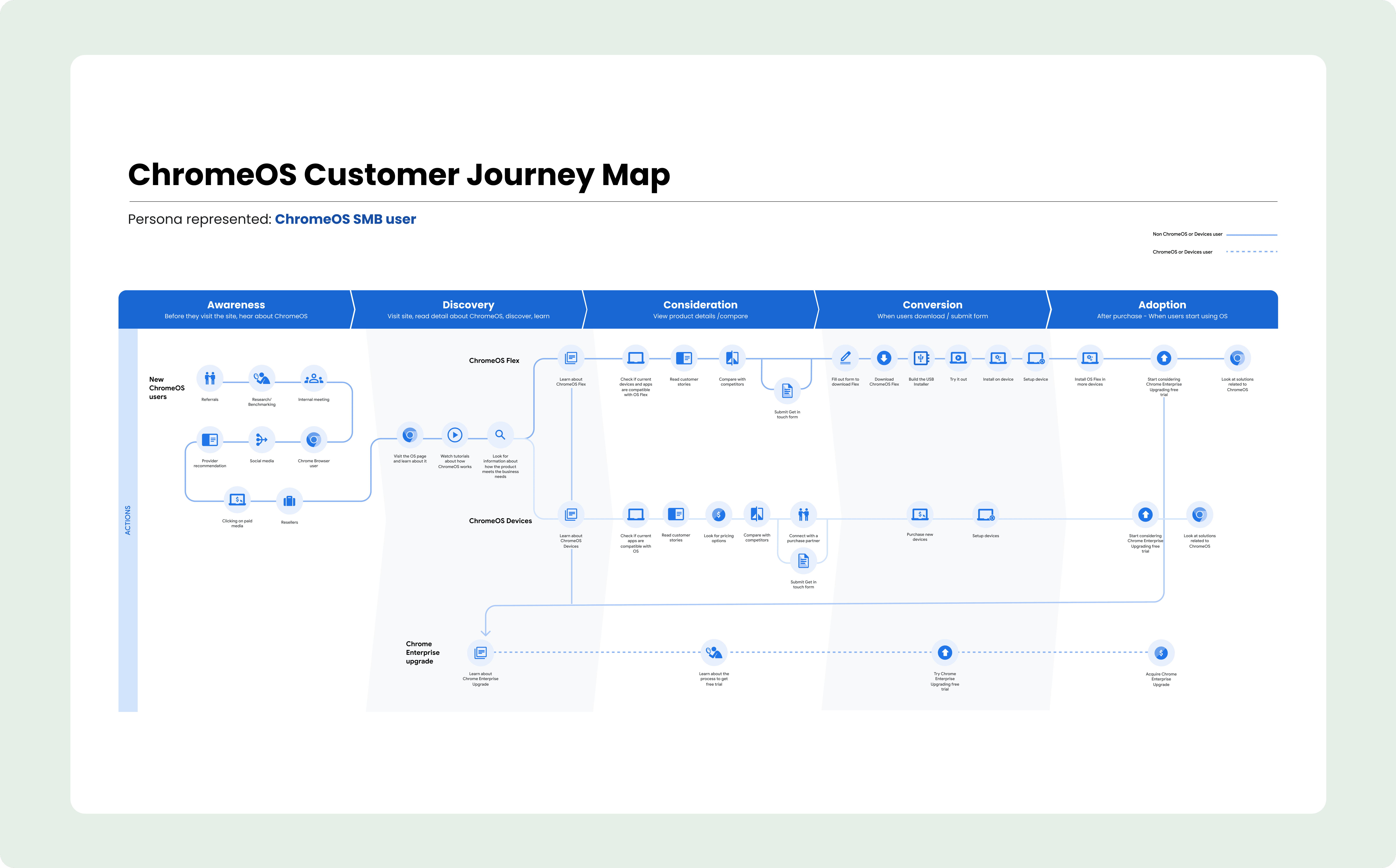
User Orchestration: Mapping the Maze
I didn't just map screens; I mapped the "Why." I broke the Chrome Enterprise ecosystem into distinct funnels based on user motivation.
Chrome Browser: Speed vs. Strategy
The High-Intent: Direct-to-download and setup. Zero friction.
The Researcher: Building the business case. Focus on capabilities and fit.
The Admin: Returning for files or CBCM, centrally managing 100+ policies across every OS (Windows, Mac, Linux, mobile) from one cloud console.
ChromeOS: New Gear vs. Digital CPR
ChromeOS Flex: The "resuscitation" path for old PC/Mac hardware.
The Hardware Hunter: The classic acquisition funnel for new devices.
The Upgrade: The logic bridge to Chrome Enterprise Upgrade for full security and management at scale.

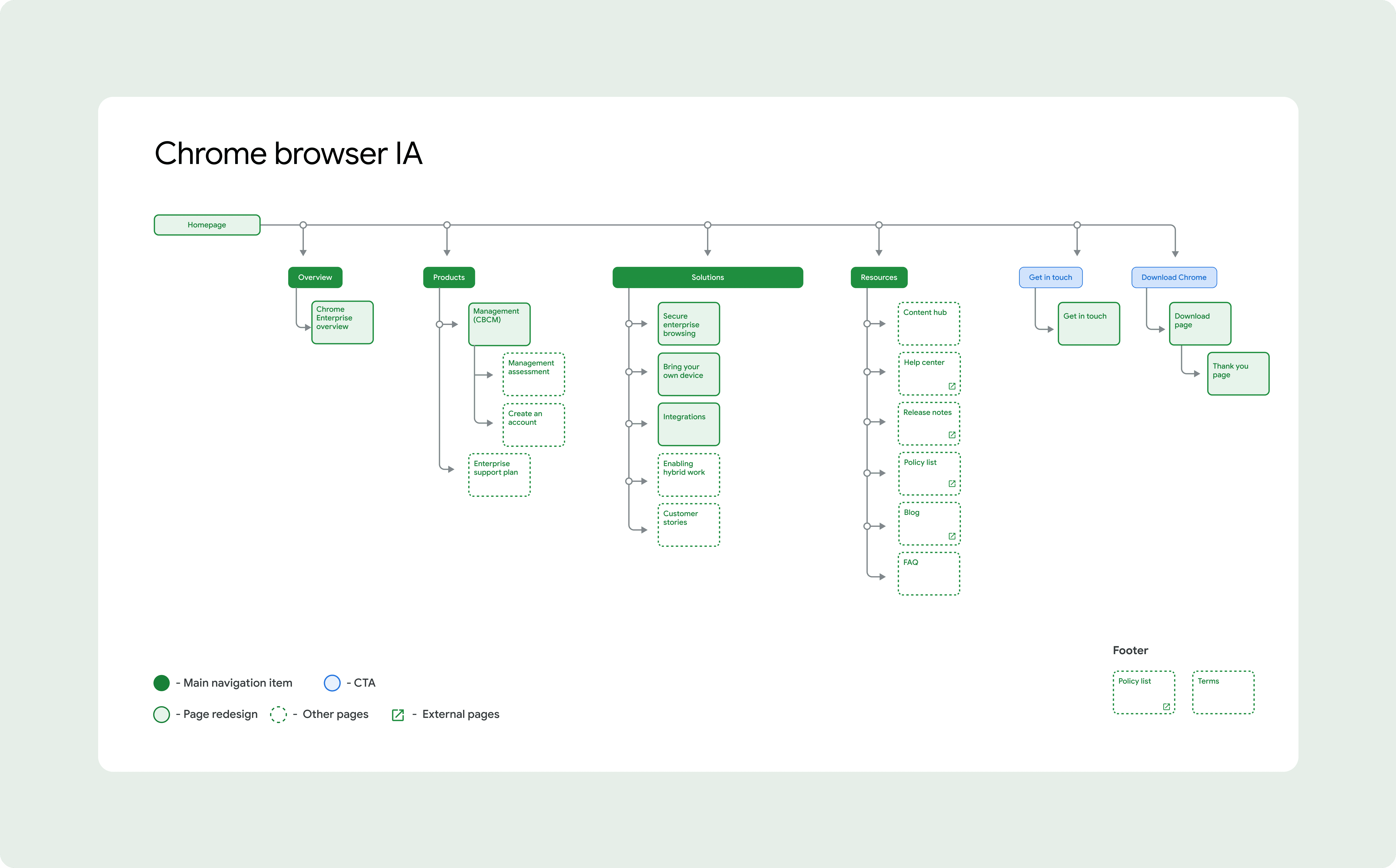
Information Architecture: Intent-Based Navigation
Building the IA was about Intent Mapping. Our research showed that users were struggling because the old site was organized by what we sold, not what they needed.
The Solution: we worked with the product team to restructure the navigation to be "Problem-First." We prioritized categories like Security, Deployment, and Pricing; the high-level hurdles our users were actually trying to jump over.

Execution: Building the System, Not Just the Screens
To hit a global deadline in 10 months without losing our minds, I worked in lockstep with our Developers and Visual Designers to pioneer a Systems-First approach. Instead of designing one-off pages, we focused on building a scalable foundation.
Collaboration on Headless Components: I partnered with the Dev team to define the logic for a library of headless components. By separating the functional behaviour of a component from its visual layer, we ensured that the core experience remained consistent across both global sites, even when the "skin" needed to adapt for ChromeOS vs. Browser.
Architecture over Pixels: This modular design system was our "secret sauce." It allowed us to assemble complex wireframes in hours rather than days, ensuring that every piece of the global launch was 100% consistent, accessible, and ready for development from day one.

Strategic Trade-offs: Prioritizing the MVP
In a 10-month sprint, you have to be a bit ruthless. Midway through, our PMs and Project Managers helped us make a choice: launch everything at 70% quality, or launch the essentials at 100%.
I supported the Lead UX in prioritizing the Security and Pricing funnels. We consolidated 15+ secondary pages into three high-impact layouts, ensuring we launched a polished, premium experience on time.


The Results: From Strategy to Award-Winning Execution
Bronze-Winning Foundation
I wrapped my part after the UX and Information Architecture were locked, but the "North Star" we built took off. The Google Chrome Enterprise redesign went on to win Bronze at the 2024 Creativepool Awards; a massive nod to the squad’s initial vision.
The Canada Launch & Handoff
Before rolling off, I ensured the transition from UX blueprints to Visual Design was seamless. My goal: make the headless component logic and journey maps foolproof for high-fidelity production.
Global Milestone: The first iteration successfully launched in Canada, marking the official decoupling of the ChromeOS and Chrome Browser ecosystems.
Operational Efficiency: By building a modular system before the handoff, I reduced design-to-dev friction, giving the team a clear roadmap to follow long after my part was done.
Lessons from the Trenches
Dev is a Superpower: This project proved that involving engineering on Day 1 is the only way to survive an aggressive 10-month timeline.
Design for Longevity: Investing in deep research and a rigid design system pays off. When the foundation is solid, the work stays award-winning even as it passes through different hands.
Check the live sites here: